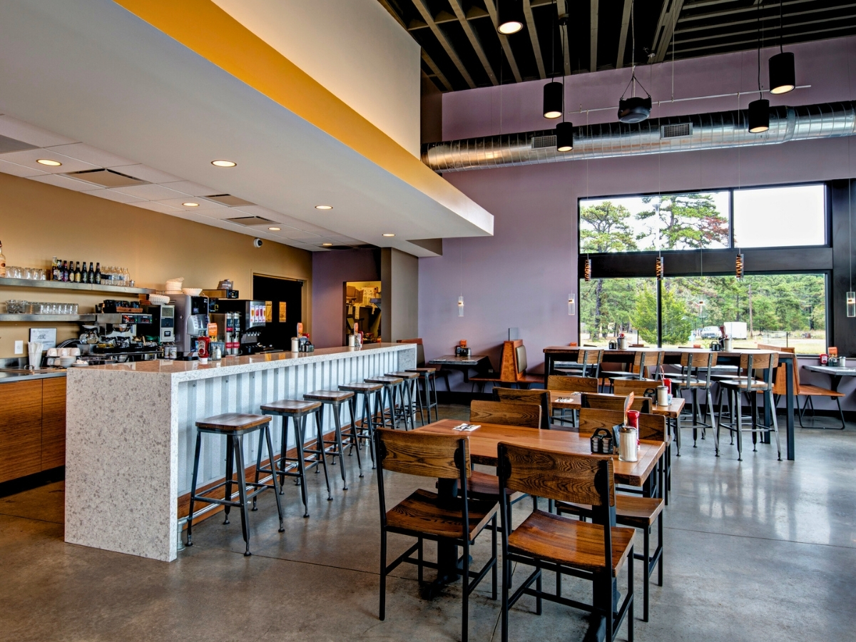
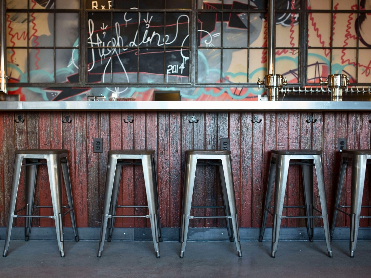
In many cities, restaurant space comes at a premium. So much so, in fact, that many owners have to start with a little less room than they might like. For example, in New York City purchase prices range from $99 a square foot in Queens up to $2,521.00 per square foot in Central Park South. That is a huge difference and has a major effect on how much space an owner can afford.
But, tight spaces aren’t necessarily a bad thing. They can create a sense of intimacy and make a business seem more desirable and look busy even with fewer patrons. They also generally keep overhead costs like rent and electricity down, requiring fewer sales to turn a profit.
Keep in mind, however, that there is a difference between intimate and uncomfortably cramped. The trick is to take a tight space and make it feel comfortable instead of just jam-packed? We have a few expert tips that can help.
Planning
Optimizing restaurant space starts from the very beginning. With the very first step of planning the layout it is important to get the ideal front of house/back of house (ie. Kitchen to dining room) ratio.
Often owners are tempted to create a large kitchen to service their restaurant. It’s easy to think that you need to allocate plenty of space to the kitchen since it is such a hub of activity. Every bit of extra space that you give to the kitchen is that much less space you have for diners, tables, and the opportunity to turn a profit.
an award winning design firm based out of Orlando, Florida, recommends saving 1/3 of the space for the kitchen and 2/3 for the dining area. Fast-service or banquet service establishments can have smaller kitchens and dining rooms, helping to increase profit from higher sales volumes. These kitchens can occupy as little as 25 percent of the total floor space, for a 4 to 1 dining area to kitchen ratio.
Organization is key for a small kitchen; everything should have its place. Shelves and hanging racks are great for conserving counter space by utilizing all available surfaces.
Divide the room into stations, so each employee has a designated work space. This will help to cut down on unnecessary kitchen traffic.
To make a small kitchen work consider paring down your menu offerings; limiting the amount of items, will reduce the space needed for prep and cooking. There will also be less need for storing different types of ingredients. Also having as much prep done before the rush will making working out of a small commercial kitchen a lot easier. Don’t sacrifice food quality but try to prep beforehand.
Owners will have to get creative to save space and work out a system but ultimately the hard work and innovative thinking will be rewarded with added efficiency throughout the business.
Design & Decor
There are some tricks that you can use to make your restaurant appear larger; the first of which is the color of your walls. Light colors make your walls recede in appearance. This small adjustment can help to make your room seem bigger and having your customer’s feel a bit less claustrophobic.
Another way you can use your walls to create space is by putting wallpaper on the ceiling; this creates interest that directs eyes upwards and encourages guests to perceive the ceiling to be taller than it actually is. Try to select wallpaper that matches your overall design. Don’t just put any design on your ceiling in hopes of making the room appear larger but consider the overall atmosphere of the room and choose a paper that ads to it.
If you have room on your walls, consider using mirrors to give the appearance of larger room. Use a focal point and angle your mirrors toward it to give the illusion of depth. If you are feeling a bit adventurous try a strip or two of mirrors. Using a mirror across an entire wall can feel confusing. Try to break it down by having strips of mirrors that do the work of expanding the room without reflecting every detail and confusing the eye. Mirrors can also be used to make an asymmetrical room into a symmetrical space which not only creates the illusion of space, but is more pleasing visually.
As far as lighting goes, try to keep your light sources off of the tables. It can crowd the space and make it difficult for patrons to comfortably eat. Instead hang the lights over the tables to create an intimate ambiance. If that doesn’t work using wall mounted lights is also a great space saver.
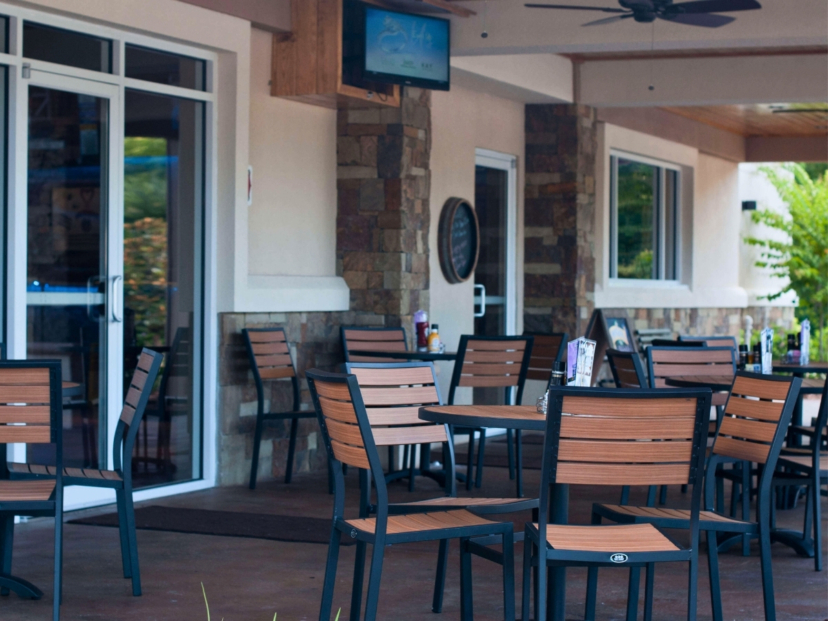
Another creative trend the industry is currently seeing is many businesses using rolling garage doors to add usable space to their design. During poor weather they remain shut while letting in some light. When Mother Nature is a bit kinder, the doors can be lifted to open the space to an outdoor area set up for outdoor dining or just general mingling.
Entryway
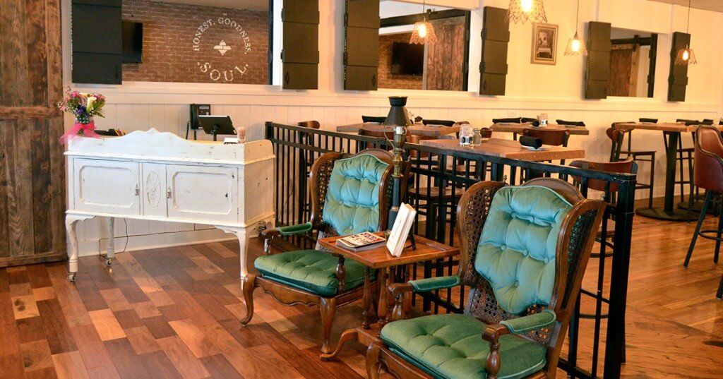
With limited space chances are your waiting area will get plenty of use, so try to make it as comfortable as possible. Creating a good flow in this area will help your guests who are leaving the dining room to do so easily, and leave availability for those currently waiting for a table. Creating a comfortable waiting area also helps in terms of customer’s overall experience; you want them happy when they arrive at their tables and not frustrated and looking for a reason to complain.
Avoid big couches that will make our space seem smaller in favor of benches or chairs. Try to avoid a bottleneck by having a small bar area where patrons can order drinks and chat while waiting for an available table.
The dining room is a restaurant’s stage. A place where all the hard work and preparation comes together to create a master piece created for the customer to enjoy. Don’t let poor furniture choices detract from the overall experience. Just because the dining area isn’t the largest, that doesn’t mean its effect on the customer will be any less inspiring. A few rules of thumb can help you to use your furniture to help and not hinder.
Tables
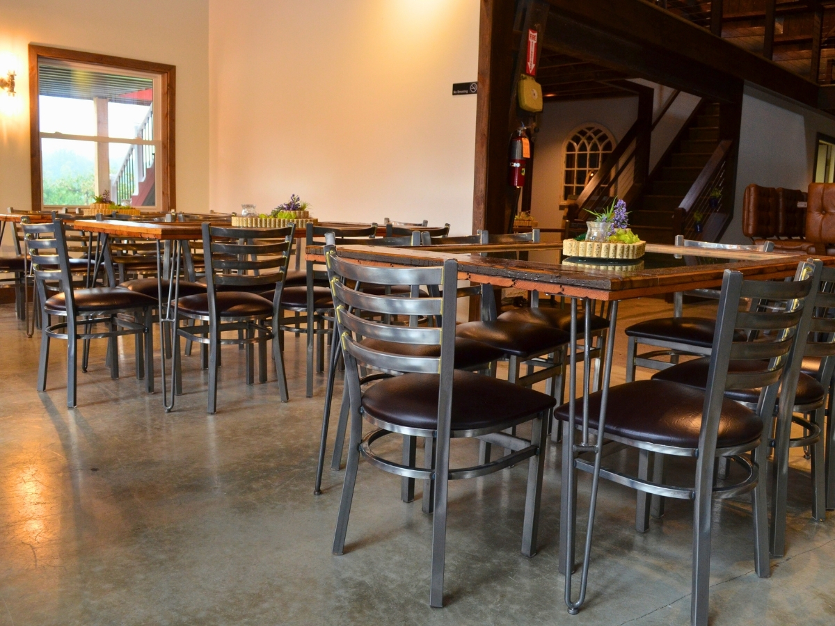
Smaller square tables is a good place to start when creating a layout for a restaurant that is short on space. 24”x 24” or 30”x 30” is a good size to start looking at. They offer flexibility in your layout. If most of your customer base is couples on a romantic night out, a smaller table is perfect for that intimate feel. On the opposite end if you have a party of 12 coming in for a birthday celebration, smaller tables can be moved together to create the banquet table you need for that party.
Tables should be at least 24-30 inches apart. This allows for not only guests but servers to maneuver comfortably. Cramming furniture together can lead to poor service, which can lead to a poor yelp reviews and decreased traffic.
Chair
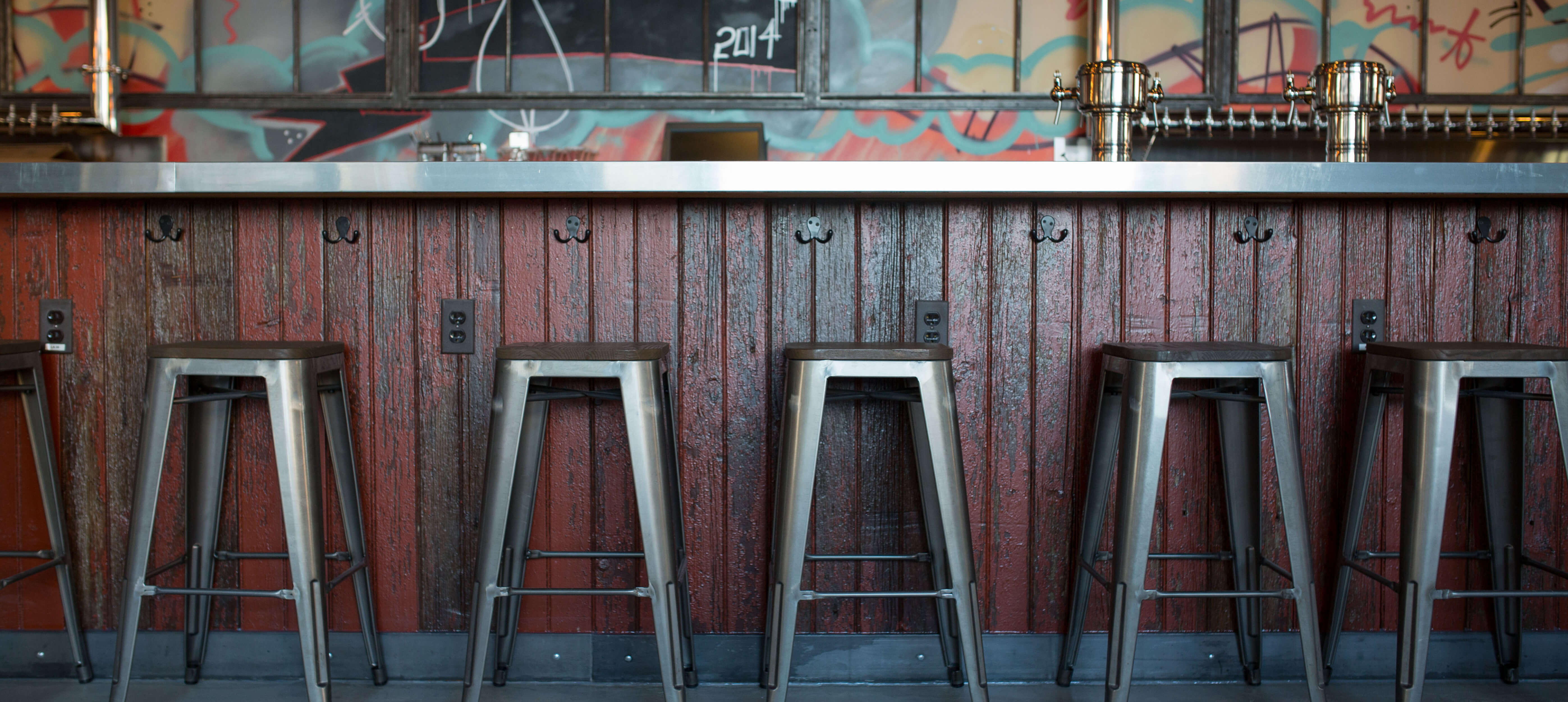
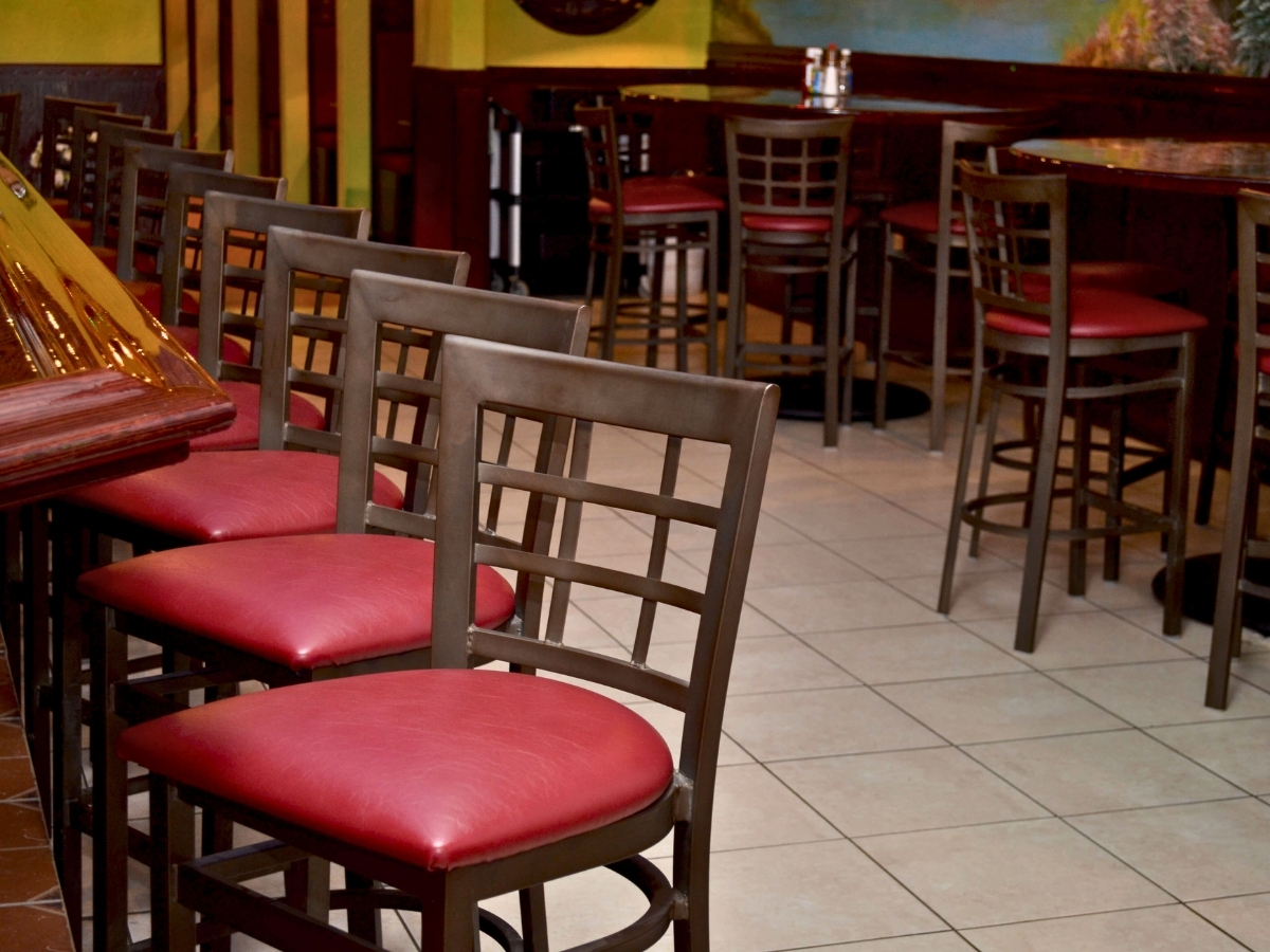
To go along with those smaller tables you will need chairs. Consider chairs that don’t have arms. At the time of purchase it may only seem like a couple extra inches of space to get the chairs with arms but eventually those inches add up. Chairs without arms help to increase flexibility in your overall layout. If you are looking to add space at your bar, look into backless bar stools. Don’t have a bar? Bar stools can be paired with bar height tables to save on space. They can be placed closer together without feeling like you are packing your customers in like sardines.
Booths
Investing in booths can also be a great space saver. You’re thinking, “Those big bulky seats will save me on space?” Yes, yes they will. A booth that seats 4 people will actually take less space than a comparable table and chairs. Plus, depending on the number in their party it can give patrons the opportunity to spread out during a business lunch or allow for more relaxation. It also allocates more room for servers. People tend to stay in the area of the booth instead of leaning into aisle ways where busy servers could be rushing to their other customers. Custom booths can be created to fit the look and layout of your restaurant so that the style flows naturally.
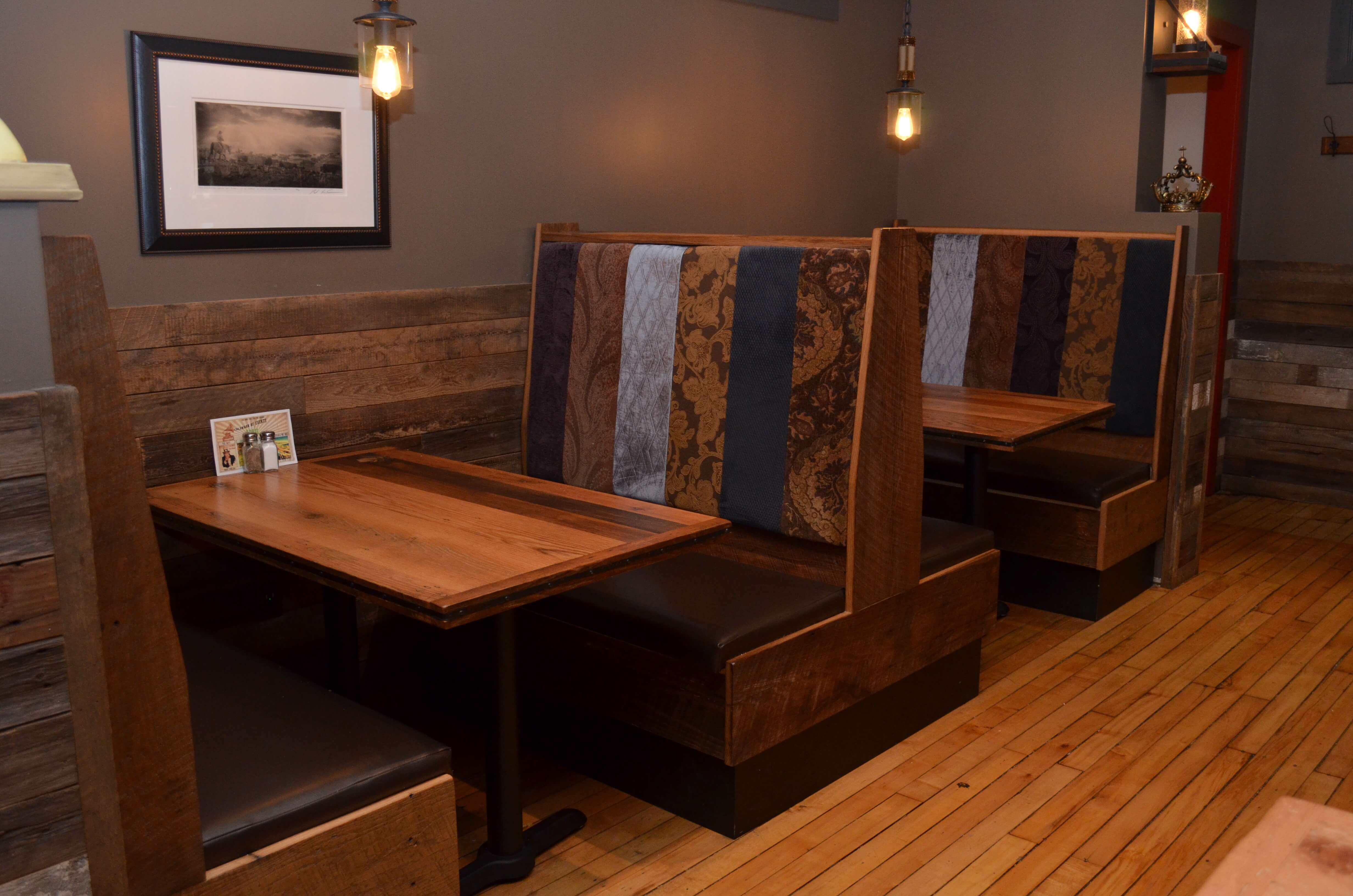 As an added bonus, studies show that the average patron spends more while sitting in a booth than at a table. Each customer spends an average of $2.00 more when seated at a booth.
Another piece of furniture to consider when designing your layout is the hostess station or a POS system. Do your best not to place it in your dining area. It adds to the look of being over crowded as well as being visually displeasing to patrons. Those stations are often very large and can take up space that could be used for additional tables and seating.
One of the most important things to do, but often overlooked, is leave enough space for your servers to easily navigate. It sounds obvious but nothing makes a space seem even smaller quite like having staff that are running in to tables and surroundings all the time. Heaven forbid your staff run into each other and drop their trays or worse. Drop it on a customer.
Conclusion
If you have a restaurant in a small space and are having problems, take a look at your layout and design. You may have too bulky of furniture for your area, or not utilizing your space well. Through planning, preparation, and some creative thinking, a small space can be adjusted to be not only pleasing to the eye, but also allow for great work flow.

