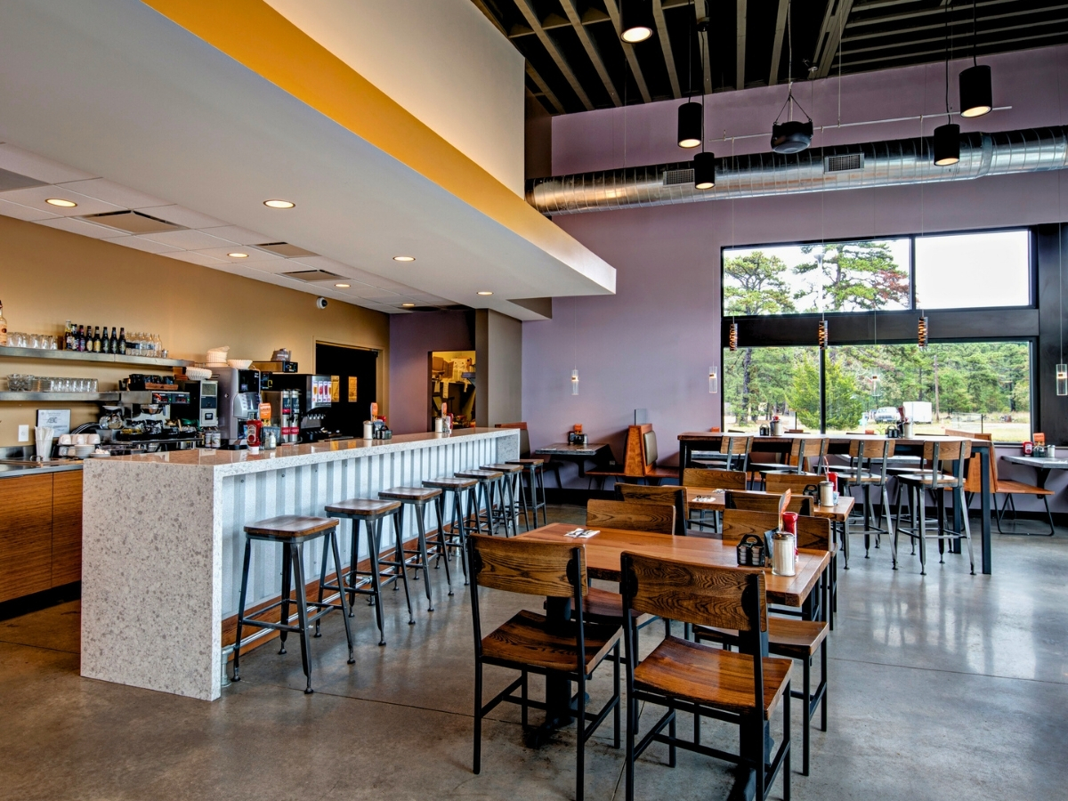
So you’ve secured a space for your new restaurant and are so excited for what lies ahead. The realtor hands over the keys and you place them into the lock and turn. You feel the doors give and excitedly push them open to behold your new space in all its glory. It’s beautiful, it’s magnificent, it’s… really big.
You begin to get nervous. The space didn’t look so big the first time you looked at it when it had furniture. It’s a lot of space. What if you bit off more than you can chew? You don’t want customers to walk in the door and think the place looks empty. Don’t worry. With a few changes, you can make your large space a comfy eatery filled with customers in no time.
Planning
Making sure you make the most of your space starts at the beginning. When you start designing your layout you need to ask yourself a few questions. The first question is how much space you want to allocate for the kitchen and dining areas. The Evans Group, an award winning design firm based out of Orlando, Florida recommends saving at least 1/3 of the space for the kitchen and 2/3 for the dining area. Since you have a good amount of room to work with, if you want to play around with those numbers, go for it. A 40% kitchen and 60% dining room is still a good split but allows for extra staff space.
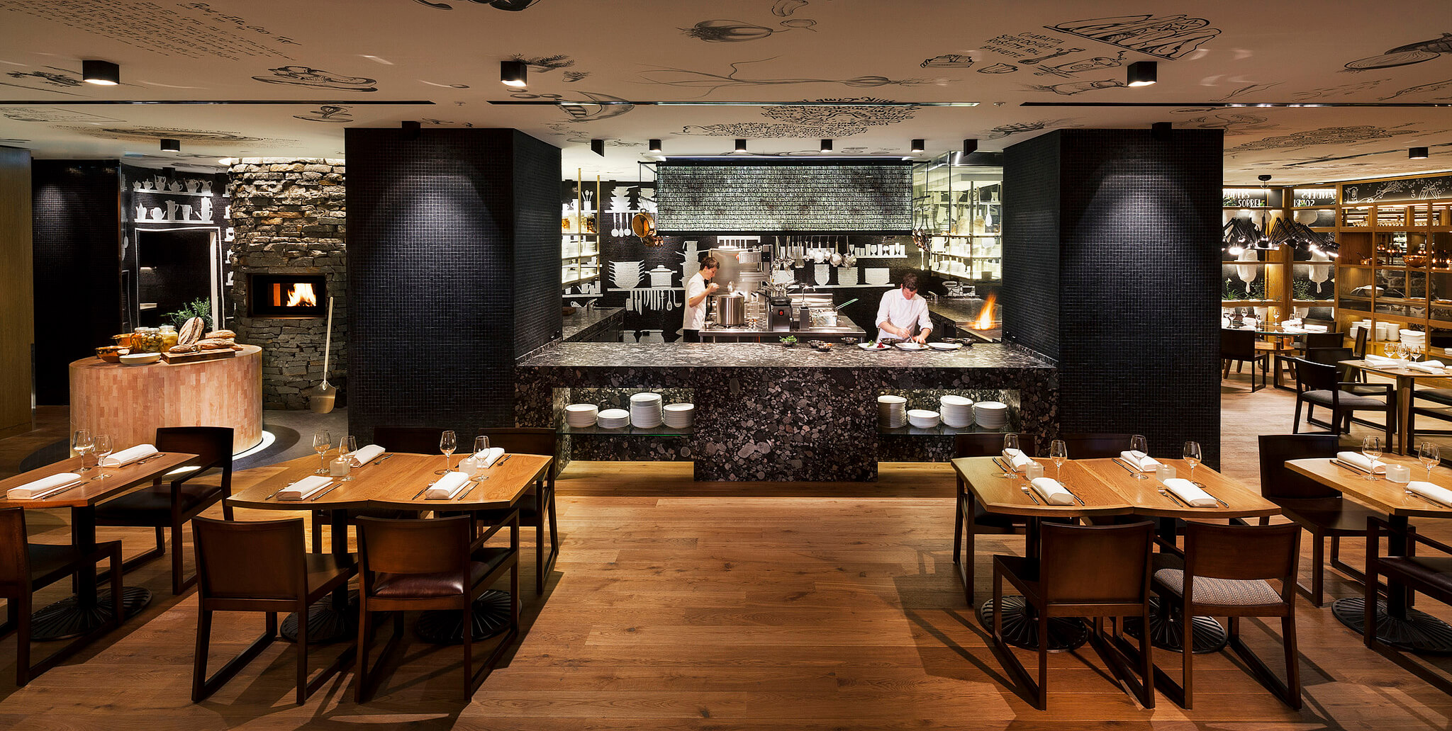 Now that you know how much space is needed for the kitchen consider where you want to place it. More and more restaurants with ample amounts of space are placing their kitchen in the center of the dining area for all to see. An open layout allows customers to view exactly what is going on in the kitchen, satisfying their curiosity and hygiene concerns. Doing so also helps to make your large space seem more intimate and cozy. With a significant portion of the room being used for the kitchen and the tables being placed around it the layout feels closer to something a diner might experience at home.
If an open kitchen doesn’t fit your taste that is fine too. Once you have an idea of where your kitchen is going, the next question you need to consider is how many rooms you need. To make it feel more intimate consider dividing part of your space into a private dining area. You can market to local businesses looking for a meeting space or offer a quieter dining experience to groups celebrating a special occasion. Who doesn’t like the opportunity for more profit as well as a way to break up the room?
Private dining areas also lend themselves well to customization. Because it is a separate area, the room can change to have a completely different vibe than the rest of the restaurant. This opens your restaurant up to catering to different markets you might not have been able to reach before.
Not ready to commit to building a private dining area? To test it out owners can purchase temporary dividers to create an intimate space even in a large room. Once the event is over the barriers can be removed and -voilá- the room is back to its original size.
Furniture
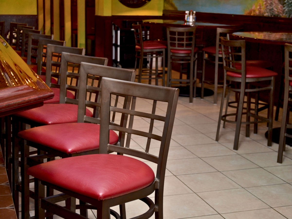
Now that a rough layout is starting to take shape it is time to consider your furniture. Since there is a lot of space to work with you can have fun with bulkier pieces if you like. Chairs and bar stools with arms are great at providing a way to add comfort for your guest and to take up a little more space to make the area visually appealing.
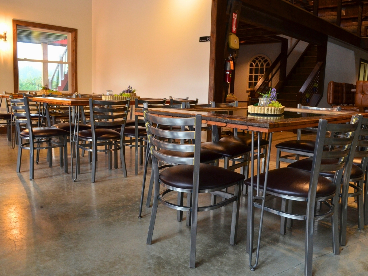
Sticking to tables and chairs is also a great way to fill your restaurant. While booths may seem bigger, they are actually space savers in the way they allow more people to fit around a table. Table and chair sets also offer a flexibility that booths don’t. If you need to move things around to accommodate larger groups you’ll have no problems.
When considering what table tops to purchase, take a look at round tables if you are looking to use up more area. Not only do they take up a large amount of space but are more conducive for conversation. Additionally, they are less formal and more homey-style to give your large room additional comfort.
Something to keep in mind when selecting furniture is how much square feet you want to allot per customer. According to the North American Association of Food Equipment Manufacturers (NAFEM), the chart below shows the average allotted square feet per customer by service type.
| Type of Operation | Space Allowance Per Seat (SQ. FT.) |
|---|---|
| School Lunchroom/Cafeteria | 9-12 |
| Banquet Room | 10-11 |
| Table Service | 11-14 |
| College or Business and Industry Cafeteria | 12-15 |
| Table Service at a Hotel, Club, or Restaurant | 15-18 |
| Commercial Cafeteria | 16-18 |
| Counter Service Restaurant | 18-20 |
Between tables and chairs, you’ll need a passage area of 18”. However, you might want to consider wider aisles of at least 36” to accommodate wheelchairs in accordance with the Americans with Disabilities Act (ADA). Handicap accessible restaurant furniture needs to make up at least 5% of your furniture, according to their regulations.
When planning your furniture layout also consider your restaurant’s needs. Fine dining restaurants need enough room for meal carts; while family-style restaurants may use bussing carts to clear tables. Both need enough space to easily move around the dining room.
Entryway
With so much space to experiment with, owners can use furniture to create a statement area in their entryway. Good flow is crucial to any entryway but feel free to explore your options with larger furniture, as long as you aren’t blocking doors. Nice padded chairs and couches could be a great option for buildings with room to spare. Creating a comfortable waiting area also helps in terms of customer’s overall experience; you want them happy when they arrive at their table. Uncomfortable chairs are not too conducive to happy customers.
Another way to utilize some of that space is by using an interesting hostess or POS (Point of sale) station. Other than helping your staff to stay organized, a unique piece at the front of your restaurant can really set the tone for what your customers can expect based upon your décor. A reclaimed POS station at a gastropub says one thing like we have great burgers to go with our beers, while a sleek modern hostess stand at a breakfast spot says more along the lines of our specialty bacon is to die for.
Décor
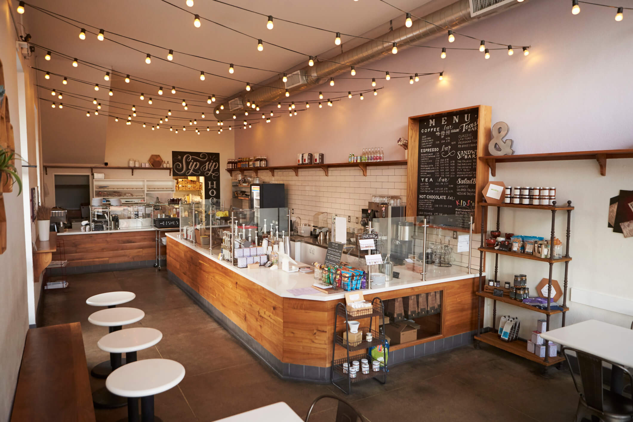
If the walls are bare, with sparse décor they will be expecting a different experience than they would in a room with décor that flows and furniture that makes the room complete. With a big open space, the view can be monotonous if you aren’t careful. A great way to add some interest is by adding strong textures.
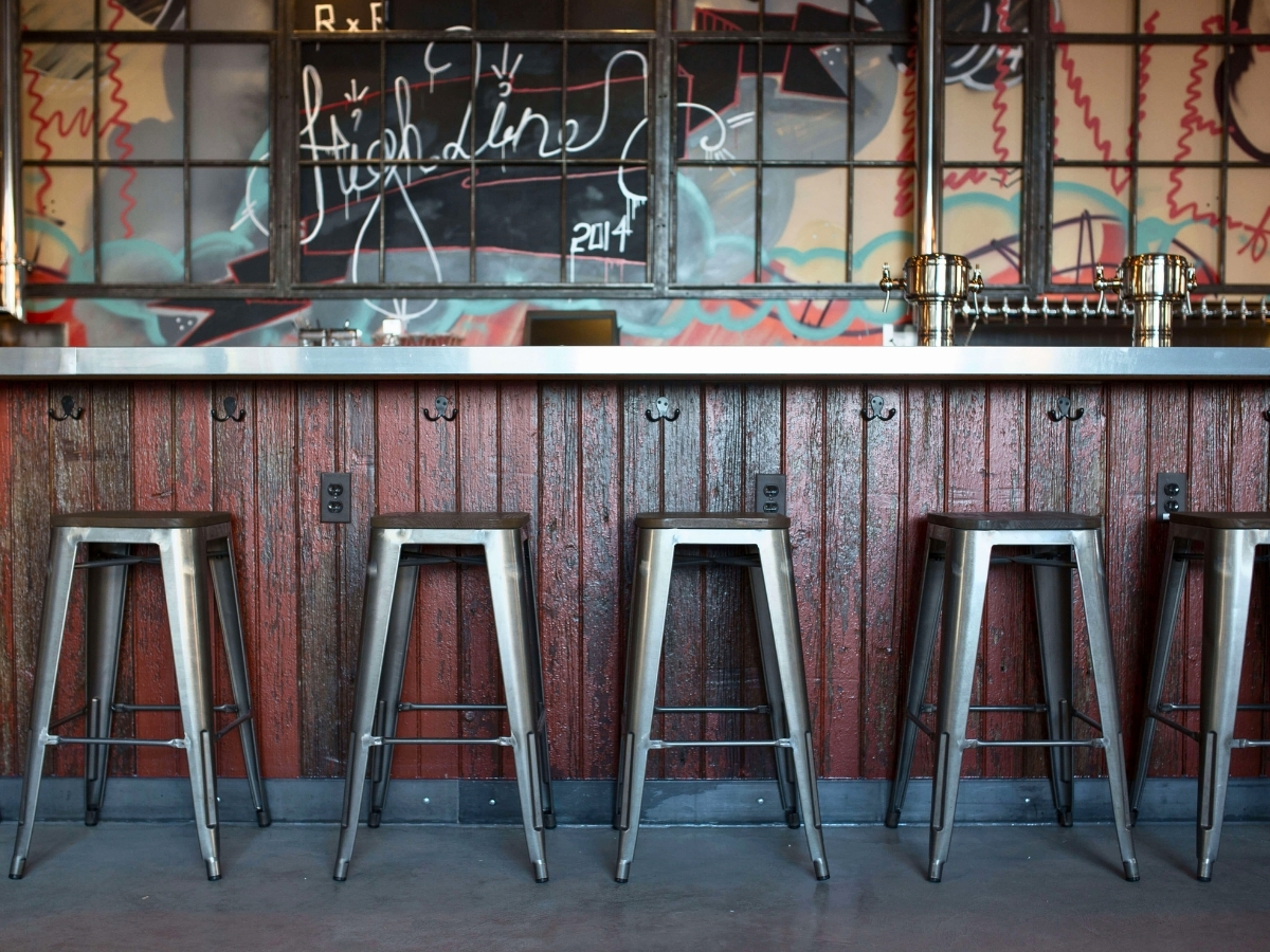
Expansive walls make great blank canvases. A mural is one way to create visual intrigue for customers as well as a way to share a little bit more about your business and your vision. The options for subjects are endless. If you can find a local artist you can work together to create a masterpiece that says exactly what you want it to.
If a mural seems to be a little too in your face for the atmosphere you want, think about adding interesting floor patterns. It isn’t as dramatic as a mural but has a similar effect in breaking up the monotony of a big dining room. Many different types of materials can be used in flooring. Whether you want a herringbone pattern in your wood floor, or interesting color and texture in your concrete floor, adding some interest to your flooring can be a unique way to break up the room.
Lighting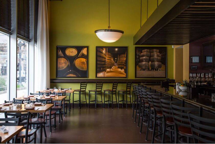
When thinking about how to decorate your building it can be easy to just slap some lights on the walls and call it a day. Lights obviously have a function but are also an area where function and design can go hand in hand. By taking your lights and hanging them from the ceilings it makes the ceilings appear closer and not as tall, making the room feel smaller and more intimate. As a bonus, interesting lighting fixtures can be a great conversation starter and help to make your restaurant stand out from others that might be looking to serve the same demographic.
Conclusion
If you have a restaurant in a large space and are having problems with flow and visual balance, take a look at your layout and design. You might not have the right furniture or decor for your area, causing your dining area to look empty and uncomfortable; potentially costing you customers. Through planning, layout, and some creative experimentation, a large space can be adjusted to play to its strengths and give customers the comfortable experience they are looking for while having plenty of workflow.

