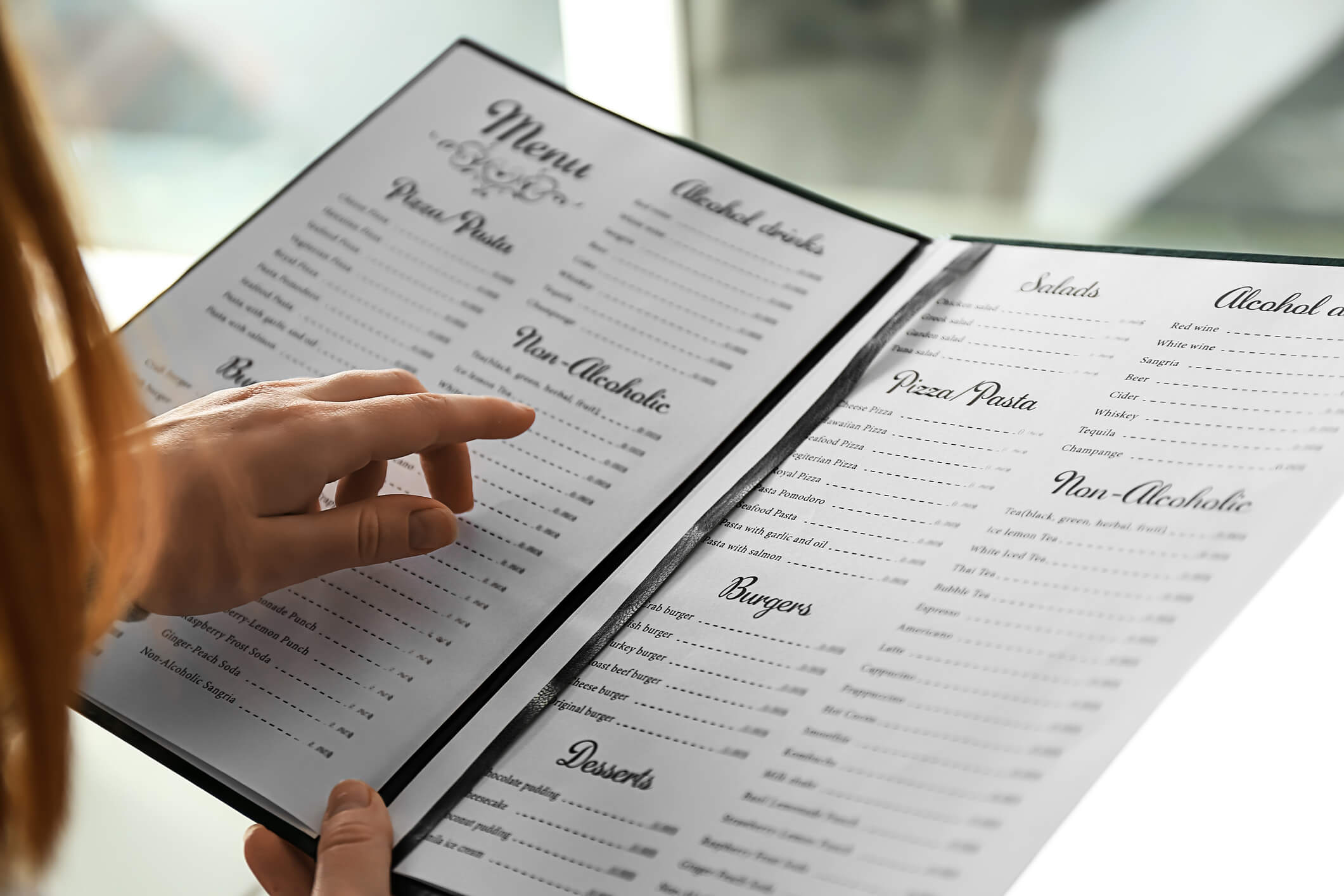
Menu engineering is about designing your restaurant’s menu to ensure your most profitable menu items are seen first and also displayed in a way that convinces your guest to choose one item (the profitable one) over another (the not-as-profitable one) while still offering enough variety to please many palettes. The first step is knowing which meals make you the most money! These aren’t always your highest-priced items, but the ones that are the most profitable to your bottom line. Once you know which items you want to demand the attention of your restaurant guests, then you’re ready to start laying your menu out. There is a lot of information out there on menu engineering, including software that you can purchase to create a highly profitable menu design. But who wants to spend extra money or take the time to dive into all the theories in order to study the science behind how people read menus? To save you time and money, I’ve put together an easy-to-follow list of general guidelines that will help you create an attractive menu, which will also serve as an effective sales tool. I’ve combed through many articles, listened to a few speakers on the topic, read the studies, reviewed the statistics, and trusted my expertise as a marketer (and as an avid eater-outer) to serve you up the best advice out there on menu design. (Please note, these tips are for printed menus, not digital or iPad menus.)
1. Choose a one-page, bi-fold, tri-fold, or book-style menu. This depends on how many dishes you offer, but typically, less pages is better. If you can shrink your menu to a one-pager without sacrificing readability (such as font size), go for it. If you can separate your breakfast menu from your lunch from your dinner, try it. If you can offer a wine, spirits, and beer list separately, why not? Use inserts to promote profitable seasonal specials.
2. In general, people will start by looking at the top right of any given page or spread. For tri-folds, they start at the top center of the middle panel and make their way counter-clockwise around the menu (so the top right page is the last spot they get to). The lower right hand quadrant, back page, or last page are going to be the last places their eyes fall. Knowing this, you can put the most profitable items where their eyes go first and bury the least profitable items in the areas of the page where they might not even get to before they decide what they want to eat.
3. Place your top three most profitable items into a box on the page. Boxes (or circles) draw the attention to that item. The boxes should be separated and balanced on the menu. Shading or color will also draw attention. Be careful not to pick more than three items, though, because you don’t want to overload your customers with too many highlighted selections, because you may force them to avoid them all.
4. There is a debate about using graphics and photographs on a menu. For fine dining, it’s not advised, since it lowers the perception of your restaurant. For casual or fine dining, if you are going to use a graphic or a photograph on the menu, make it count. Only show photos of your most profitable items; show the real photograph but make sure it looks appetizing! Don’t oversell your items via exaggerated artwork, though. It’s a fine line! Too many photos or graphics can be distracting, so choose wisely which items you want to highlight with an image.
5. Menu descriptions matter. Write a sentence or two about each item, not only detailing what’s in the meal/how it’s made, but also how it is going to taste. Use flattering adjectives to entice the reader; for example, explain if the item is sweet, smokey, savory, spicy, smothered, or scrumptious. If you need to hire a food critic or journalist to help you write the menu, it might behoove you. Really think about the processes, too; ‘fried zucchini’ is nice, but isn’t ‘locally grown fresh zucchini, which is hand-battered and fried to a golden brown’ better? Keep in mind your customer might be willing to spend more for a ‘bed of fresh greens including organic arugula, topped with layers of locally grown healthy veggies, homemade crunchy croutons, and sprinkled with shredded cheese’ than for a ‘house salad’ – even if they are the same thing! The more appealing the description you use to whet your customer’s appetite, the more irresistible your culinary works of art become! (Note, descriptive categories are also important. If you make the most money on your sandwich selection, instead of the boring ‘sandwiches’ title, call that section ‘the best thing between sliced bread’ and see if your sandwich orders increase.)
6. Drop the dollar sign ($). Don’t draw attention to the price; you want customers to choose their meal based on quality not cost. Keep the price tucked in next to the item description, not in a column off to the side. It’s too easy to scan the row of prices and choose the least pricey items. I still recommend using numerals (16) as opposed to spelling it out (sixteen), although there is supporting evidence to use both. I just think it makes it clearer and less confusing.
7. Be easy to understand. Use a standard font, nothing too fancy like a script. Make it an average size – don’t go below a 9 point. If your menu is easy to read, your guests will actually read it! The use of white space can also be effective in making your menu look less cluttered and less overwhelming to read.
8. Minimize the selections per category to five or fewer. If you have a pasta selection on your menu, only offer five or less. Sandwiches? Five or less. Seafood? Five or less! We humans are really bad decision makers, and too many options leave us feeling confused. So confused, in fact, that we give up thinking altogether and just pick the least expensive item. If you are a specialized restaurant, such as a burger joint with 25 unique burger creations, this might be trickier for you. In that case, make sure you do not exceed five total categories (e.g., burgers, beverages, sides, and sweets) and keep the other categories very minimal. Or, you could try breaking down your burgers into different categories (e.g., classic, spicy, smokey, tropical, and beef-less). Following this rule of thumb will actually help you cut the least profitable items from your menu, which is a good business practice anyway.
9. In any category (or menu list), place the most profitable items in the first and last two spots. Your guests will remember those the best. If you have five sandwich options, your numbers 1, 4, and 5 should be the most profitable sandwiches on your menu. Then you can sandwich (get it?!) the least profitable items as numbers 2 and 3 in the list. Going one step further, if you put a box around number 4, that will be your top-seller.
10. Trickery can be mastered. By adding in a more expensive option, it will make your lower priced, more profitable item feel like a wise decision. Customers will instinctively comparatively shop your menu, so throwing in some items that you want to use as decoys can have great results. For example, if you have a classic cheeseburger and a bacon jalapeno burger on your menu now (with hopes of selling more of the bacon jalapeno variety for profitability), but the price of the cheeseburger is stealing all the orders, you can add an overpriced premium steak burger for much more to convince your customers that the bacon jalapeno one is actually a good deal. If they can spend just $18 for the bacon jalapeno burger rather than $29 for the premium one, they’ll feel like their choice is rational. However, when only compared with the $10 cheeseburger, it might be hard for them to make the justification in their mind that the bacon jalapeno burger is a good value.
For more on the psychology of menu design, check out this video of Gregg Rapp on the Today Show.

